
The Fires Aren't Outliers
New OIA data shows how rising incidents and response variability are reshaping Aotearoa's fire risk

When fire risk becomes permanent
Every summer now feels familiar. Vegetation dries. Wind picked up. Sirens travel further than they used to. Somewhere—Tongariro, the Port Hills, the Mackenzie—a fire escapes its initial footprint and becomes something larger than an incident. Roads close. Crews are redeployed. Local cover thins.
We continue to describe these moments as exceptional. They are not.
The most important shift in Aotearoa’s fire risk is not that fires are bigger. It is that they are no longer rare enough for strain to remain hidden.

What the official data shows
The analysis below is based on national fire incident and response data released by Fire and Emergency New Zealand (FENZ) under the Official Information Act. The datasets, covering the period from 2015/16 to 2023/24, include incident volumes, average response times, and turnout-time distribution at station, district and regional level.
As far as I can find, this information has not previously been presented or analysed together.
What emerges is not a story of collapse. It is something more gradual and more structurally important.
Total incidents attended by FENZ have risen steadily over the past decade. Growth is strongest in vegetation and non-structural fires: incidents that are weather-sensitive, geographically dispersed and more likely to cluster in time.
These events have no replaced structure fires. They have added to the baseline.
Figure 1: Total incidents attended by FENZ, 2015-16-2023/2024
National incident volumes have increased steadily across the period.
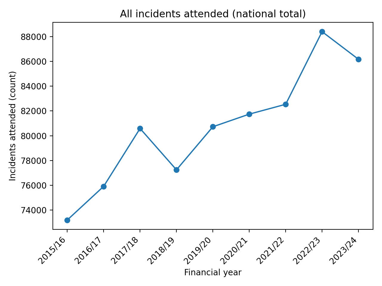
As Figure 1 shows, this is not a spike. It is a trend. By “permanent”, I mean that elevated fire activity is no longer confined to short, recoverable seasonal peaks, but increasingly shapes the system’s ongoing operating load.
Emergency response systems are designed for peaks. They are not designed for persistent elevation.
A system that still looks fine, on average
On headline metrics, performance appears reassuring. Average response times to structure fires have remained broadly stable year-on-year. On paper, the system, is holding the line.
That reassurance is not misleading. It is incomplete.
Average describes how the system performs under typical conditions. They say very little about how it behaves when demand overlaps, recovery time shortens, or resources are stretched across multiple incidents.
Figure 2: Average response times to structure and vehicle fires (national)
Headline response-time averages remain broadly stable across the period.
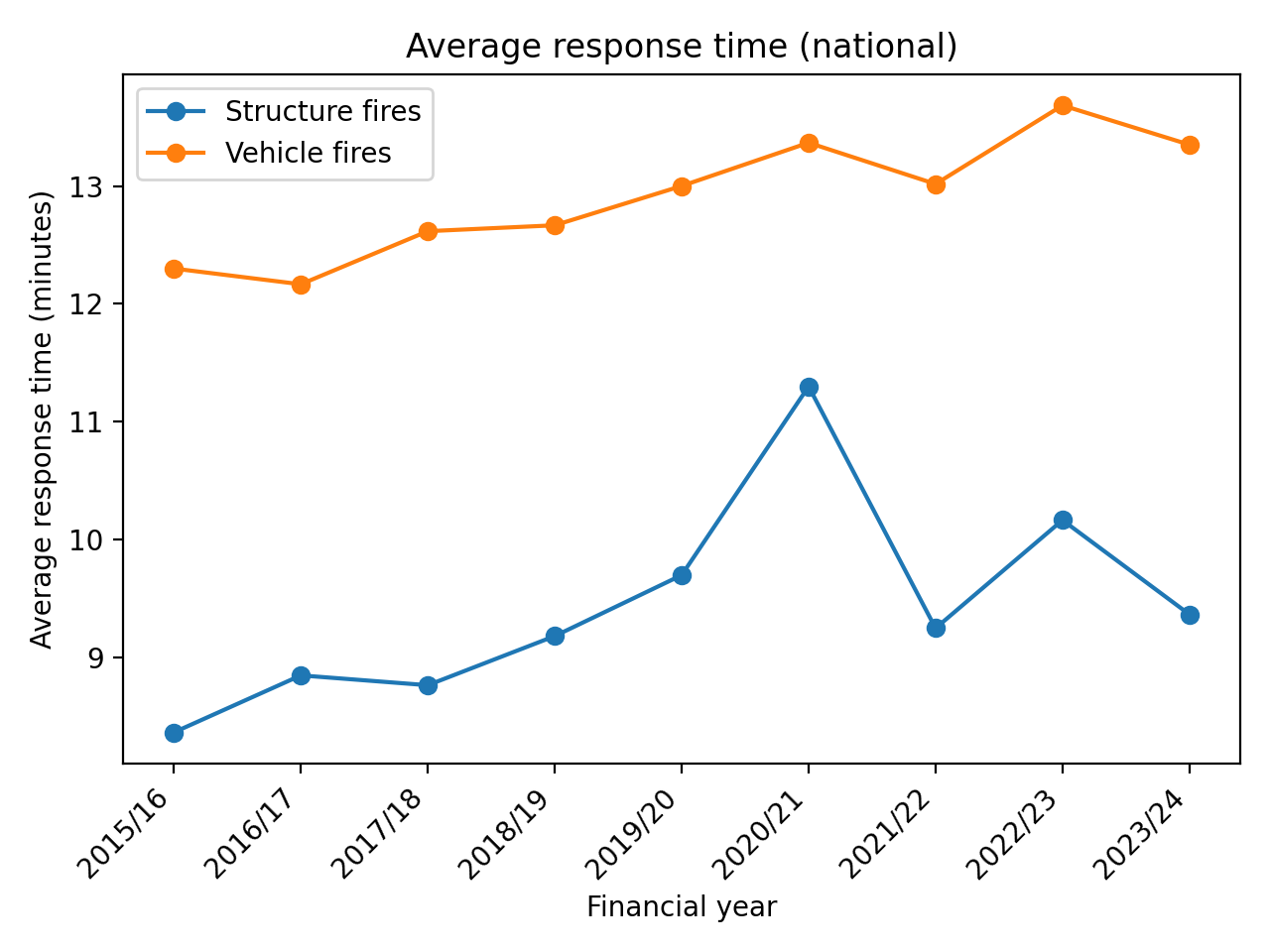
Figure 2 confirms why institutional reporting remains confident. The centre of this distribution has barely moved. The stress appears elsewhere.
Where strain actually shows up
When turnout times are examined (the interval between a station being alerted and an appliance leaving) the distribution tells a more revealing story.
Median turnout times remain relatively flat. But the upper tail extends. The slowest 10% of responses are materially slower than the typical experience, and that gap has widened over time.
Put simply: most days still look normal. A growing minority do not.
Figure 3: Turnout time distribution — median vs. 90th percentile (regional aggregation)
System strain appears in the upper tail long before it affects averages
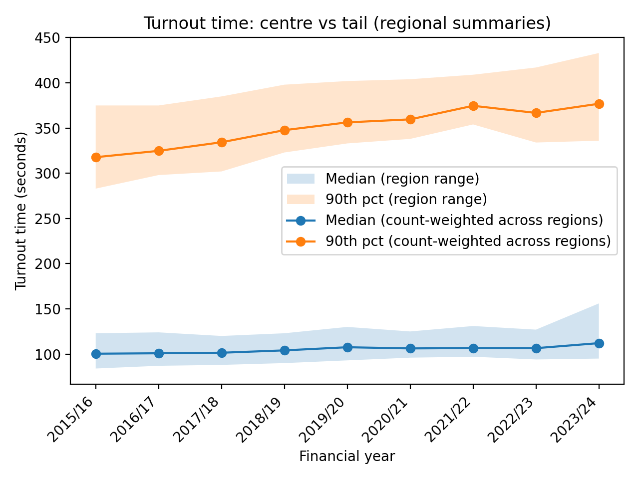
Figure 3 shows how pressure first becomes visible in resilient systems. Not as failure, but as increasing dispersion.
The data does not identify the cause of the delay. However, the pattern of widening variability is consistent with a system operating closer to its capacity limits.
Why variability matters more than speed
A slower-but-predictable system can be planned around. A fast-but-volatile one cannot.
The OIA data shows increasing dispersion in turnout times, particularly in regions with longer distances, volunteer-heavy staffing, or exposure to large vegetation fires. Extreme delays are not statistical noise to be trimmed away by opting for the use of medians in institutional reporting. They are the moments when elasticity is being stretched to its limit and resilience is tested.
Firefighters experience those moments directly. Governance frameworks largely do not.
FENZ does not systematically record when stations are under-crewed, when cover is thin, or when capacity is being improvised rather than assured. Demand is measured precisely. Strain remains largely unmeasured.
That asymmetry matters.
Tongariro is not an outlier
When large fires burn through places like Tongariro National Park, the public story is usually told in terms of scale: hectares burned, containment lines drawn, estimated days to control.
The more consequential impact is temporal.
Large landscape fires absorb crews for days. They pull resources away from local cover. They increase the probability that the next incident — the house fire, the crash, the alarm that turns out not to be false — waits longer than it should.
These effects rarely move averages. They accumulate in the tails.
Figure 4: Vegetation and wildfire incidents attended annually
Large landscape fires are adding to baseline demand rather than replacing other incident types.
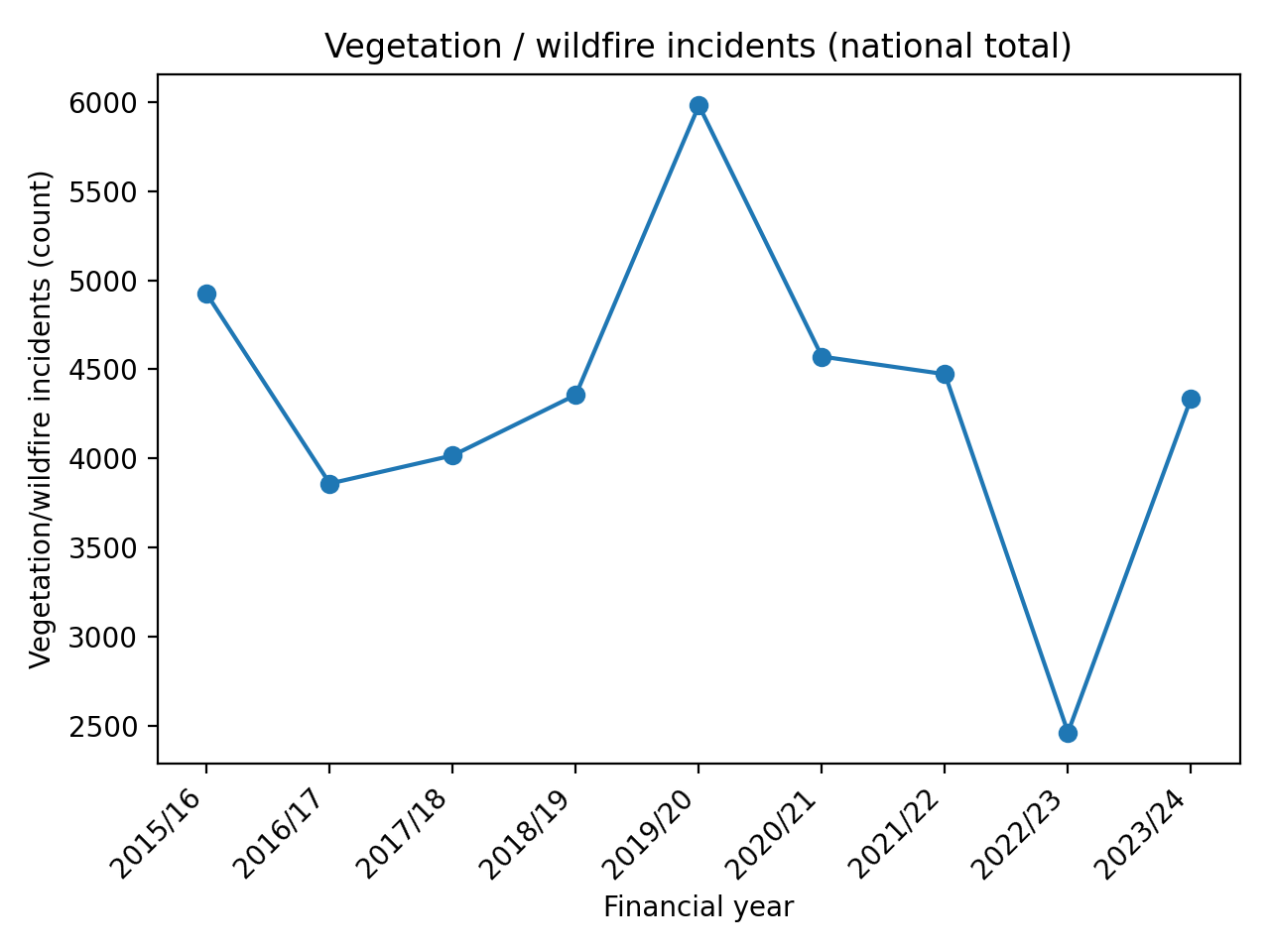
As Figure 4 shows, these fires are not episodic interruptions as the broadcasted media might seem it be. They have a degree of volatility due to the nature of them as extreme events while also becoming part of the system’s operating environment with annual vegetation fires in the thousands.
Why the strike makes sense in this context
Seen in isolation, firefighter industrial action is often frame as a wage dispute. Seen alongside the OIA data, it takes on a different meaning.
Firefighters do not experience the median day. They experience the hardest ones. Stacked callouts, redeployments, nights where “cover” is provisional rather than assured.
The data shows a system that is still functioning, but with less slack. Firefighters are responding not to today’s average, but to tomorrow’s risk. In that light, strikes are not evidence of a broken system. They are a signal that those closest to the work can see where the curve is heading.
It is easy to forget that lived experience moves much faster than institutional indicators.
A threshold now before it becomes a crisis tomorrow
None of this suggests imminent failure. That is precisely the risk.
By the time deterioration registers clearly in headline indicators, the underlying capacity problem is already embedded. Averages move later than distributions.
Aotearoa’s fire response system is not collapsing. It is operating closer to its tolerance limits, more often, in ways that are statistically visible before they become politically undeniable.
We are stuck on measuring just speed. We are not yet incorporating strain.
What this asks of us
If fire risk is becoming persistent rather than episodic, governance has to change with it. That does not start with blame. It starts with effective measurement.
We should expect
Explicit tracking of staffing stress and availability
Metrics that surface variability, not just averages
Planning frameworks that treat overlapping incidents as normal, not exceptional
Until then, we will continue to reassure ourselves with stable averages while dispersion increases beneath them.
The data already shows where pressure accumulates first. What remains uncertain is whether our institutions are designed to notice it in time.
This article draws on national fire incident and response data released by Fire and Emergency New Zealand under the Official Information Act. The figures reproduced here reflect FENZ’s own reported statistics. No modelling, estimation or re-weighting was applied. My contribution was limited to aggregating the released data where necessary and analysing the patterns that emerge.
They certainly aren’t outliers Angus. Walking through the Hollyford as a Western Australian, I could not help but see a fuel load for the ages, just sitting there waiting for climate change to prep it for ignition. Is it a possibility? Maybe not today, but what about tomorrow?
Excellent analysis and comment. In NZ we do not do enough of this sort of analysis, or take the messages seriously: this is true in so many areas, from fires to health. In large part this is because most managers have an aversion to statistics: they don’t understand them, so they don’t want to display their ignorance, and just “don’t want to know”. It reminds me of my experience decades ago of tutoring first year students in statistics, a course which most of them (e.g., medical students, commerce students, etc) were forced to do, but simply hated, and struggled to understand. They would muddle through, then breathe a sigh of relief at the end of the year that it was over. Some of these people will be the ones avoiding thinking about these issues today.